
American Airlines
Modernizing the Digital Experience of AA.com
American Airlines’ primary digital channel, aa.com, generated over $40 million per day in revenue but had not undergone a major update since its launch in 2000. The site’s design, architecture, and overall customer experience had grown dated, limiting both customer satisfaction and the business’s ability to evolve quickly.
The Challenge
The aa.com platform was:
Visually outdated and inconsistent with the brand
Technically constrained, with front-end code tightly coupled to back-end systems
Difficult to update, iterate, or innovate
Falling behind customer expectations for modern e-commerce and travel UX
The business needed more than a cosmetic refresh—it needed a foundational redesign that would support future growth and modernization.
The Work
With the right team in place, Ron led the charge to overhaul aa.com from two angles: the experience and the foundation beneath it.
The interface was completely reimagined—modern, clean, intuitive, and ready for where the brand was headed. It was the first meaningful redesign of aa.com in more than a decade, bringing clarity to the customer experience and alignment to the visual language.
A new engine under the hood
Just as important was the architectural shift. Ron pushed for a complete front-end rebuild that decoupled the UI from backend systems.
This meant:
Faster iteration
Cleaner performance
Agile experimentation
A platform finally capable of responsive, mobile-forward evolution
In other words, aa.com went from static to scalable.

The Impact
The redesign didn’t just refresh aa.com—it transformed American Airline’s digital future.
Customers experienced a cleaner, more modern site aligned with the brand they trusted.
The business gained the ability to update and improve the site at real speed.
The new architecture laid the groundwork for American’s 2013 global rebrand, making the digital transition seamless.
And the UX team Ron built became a lasting capability inside the organization, powering years of continued innovation.
What started as a stale, outdated site became a living, evolving platform—one designed around customers, guided by strategy, and built to support one of the world’s largest airlines.
“Site navigation has been greatly improved. Key tasks, like flight booking, account log-in, and flight check-in, now appear in the same navigation menu... The result is a home page that looks more like a travel retailer than “just” an airline Web site.”
Henry Harteveldt, Forrester Research
Launch
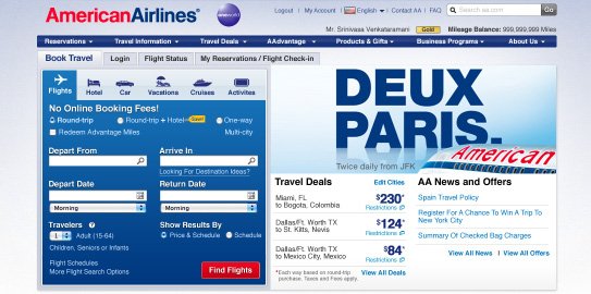
AA.com launched in May 1995.
Evolution of AA.com
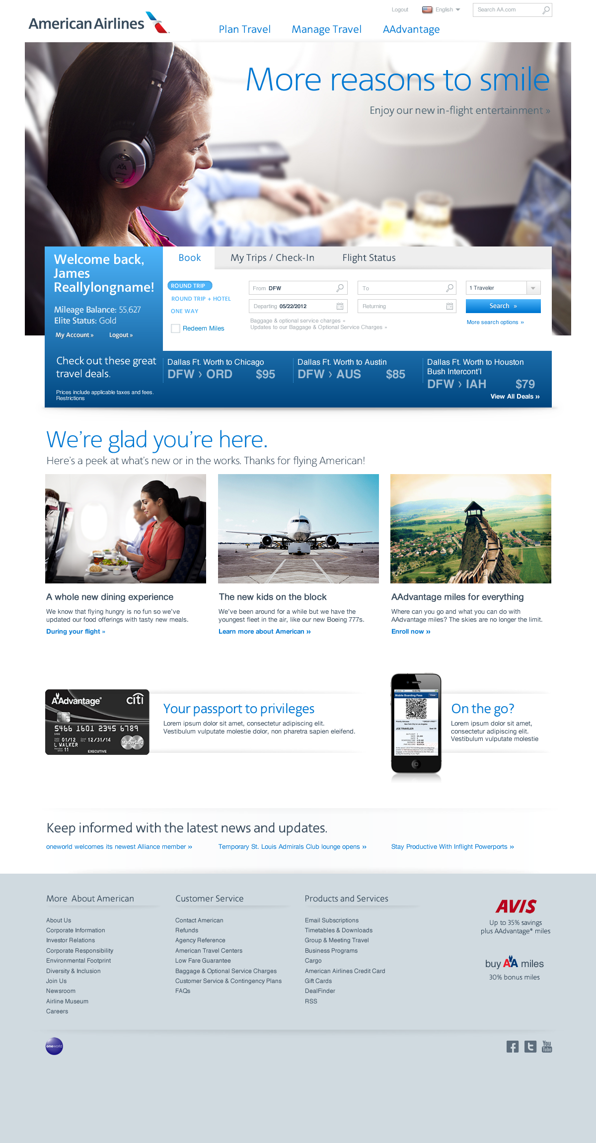
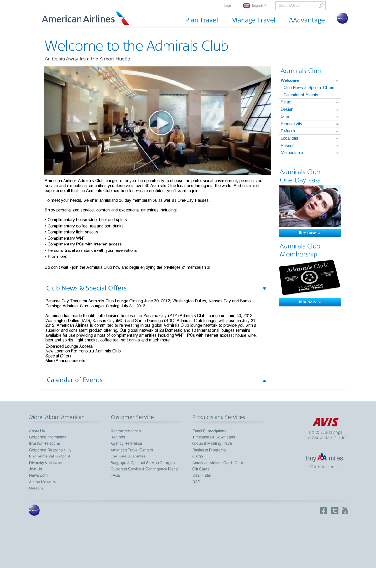
Redesign One - 2007
The interface was completely reimagined as well as a complete front-end rebuild that decoupled the UI from backend systems.
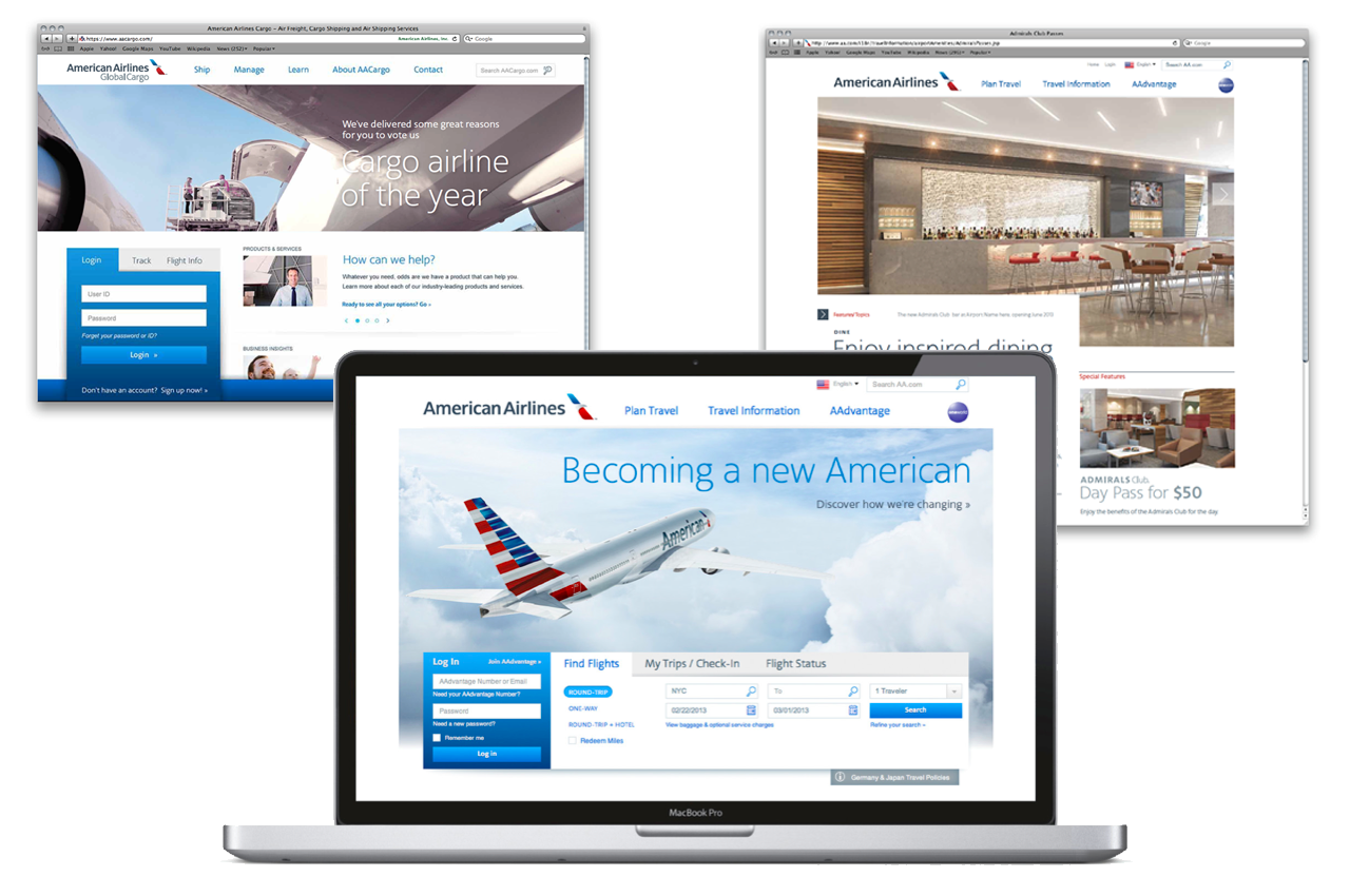
Redesign Two - 2013
The new aa.com translated American’s refreshed brand into a sleek, modern interface that delivered a customer experience worthy of the airline’s future-facing identity.