
Handle with care
Our logo is the most visible element of our identity. Please treat it with respect and kindness. Always reproduce the Sabre logo from the electronic artwork. No alteration to the logo, other than sizing, should ever be made. This includes any manipulation of the color, style, proportions or spacing of the letterforms.

Know what's a no-no
- Don’t modify the shape of the logo
- Never use an unauthorized color on any part of the logo
- Avoid outlining any part of the logo
- Don’t create any unauthorized logo locks-ups with text or symbols
- Never combine elements or text to create a new logo
- Don’t use the logo as text in a sentence or headline
- Don’t angle or distort the logo
- Don't recreate the logotype
- Never use the logo on backgrounds which can hinder its legibility
Logo color variations and usage
Protecting and maintaining consistency of our core colors is one of the most important aspects to this brand site. Please do not attempt to change the Sabre logo to any other color or screen of color.
Primary Usage
One Color Usage


HEX: E50000
RGB: 229/0/0
CMYK: 4/100/100/0
PMS 485
HEX: ffffff
RGB: 255/255/255
CMYK: 0/0/0/0
HEX: 111111
RGB: 17/17/17
CMYK: 73/67/66/83
Measuring Clearspace
Clearspace is the area that surrounds the Sabre logo. Nothing should cross into this clearspace. Our clearspace is a fixed size that’s determined by the x-height of the S of the Sabre logo that you are placing.

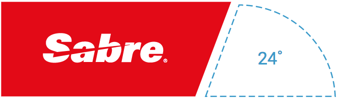
How and when to use the Slab
Standards allow for the Sabre logo to be placed into the Slab shape for print and online use where imagery plays a dominant part in layout. The Slab should not be recreated or used to house any other content or graphic. The Slab should only be placed on the left side of the artboard you’re building upon and bleed off of the top or the left vertical can either bleed off the left or live within the left side of the artboard you're working with.
Retired logos that should never be used
The following logos have been retired from use and should not be reintroduced to any new piece of communication.